
I hate it here.
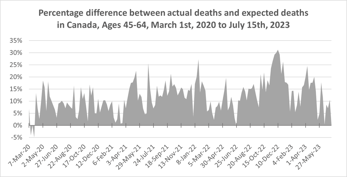
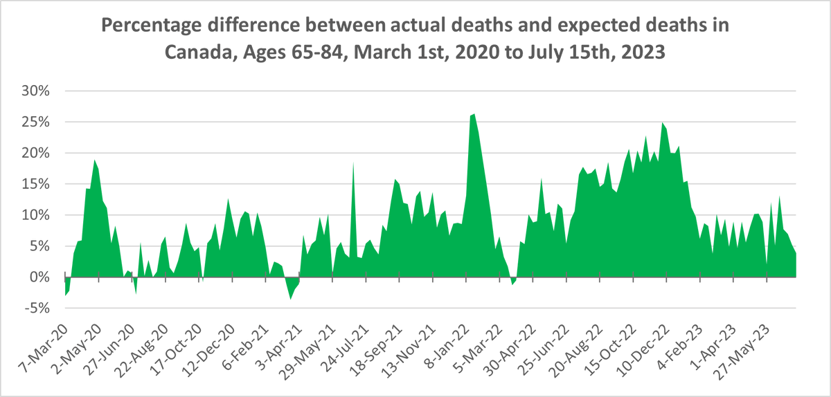
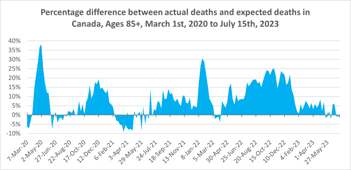
Here is percentage excess mortality for each age group. (i.e. weekly deaths as a percentage above/below the number expected) The 0-44 chart haunts me. Note the differing y axis scale between charts.

I hate it here.
Here is percentage excess mortality for each age group. (i.e. weekly deaths as a percentage above/below the number expected) The 0-44 chart haunts me. Note the differing y axis scale between charts.